Futures Survey
some eye-opening long-term charts

I just went through 180 long-term commodity and futures charts. Here are those I found most interesting (remarks in caption area below each image)
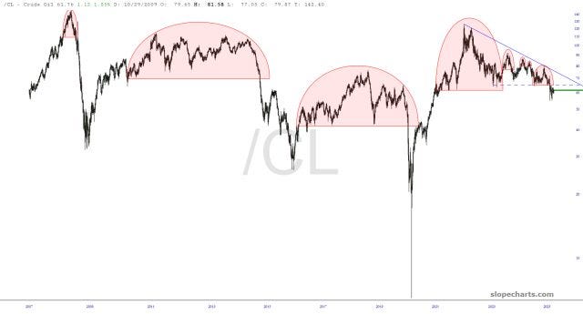


I just went through 180 long-term commodity and futures charts. Here are those I found most interesting (remarks in caption area below each image)
